7 Tips To Style Your Shelves
Unlike other storage options in your home, such as cupboards, drawers, wardrobes or chests, shelves also serve a distinct aesthetic purpose - that’s because they are open to view. The flat shelf surface space is a useful storage space for books, ornaments, and more. But if it’s just piled up or stuffed into place, shelves can look messy. Equally, shelves that are underused can make a room look sparse and unloved, like a supermarket after some ill-advised panic buying.
So, how do you go about styling shelves in a way that avoids clutter but has enough features to draw the eye and look like a designed and deliberate part of the room? The below hints and tips tell you everything you need to know to get the balance right, as well as offering some clever insights on how shelves can stand out in their own right.
Of course, how to style shelves depends in part on which room they are located. For example, you’re unlikely to keep too many bookshelves in the bathroom, and your ornamental arrangement might be a bit different in the kitchen than the living room. But in general, the following will apply.
Don’t let one item dominate
If you’re a big reader or music lover and are justifiably proud of your books or vinyl collection, then by all means show them off. After all, what’s a collection for if you’re not free to peruse at your leisure? But to prevent shelving units looking a bit too utilitarian or like the local library, then mix it up by creating spaces for decorative items. This draws attention and creates a focal point for the eye. It also makes your shelf space look more interesting and varied, displaying a range of interests, passions, and perceptions.
You can add framed picture memories of family members or holidays, and artwork or decorative boxes create height variation and visual interest for a more dynamic shelf line.
Use symmetry

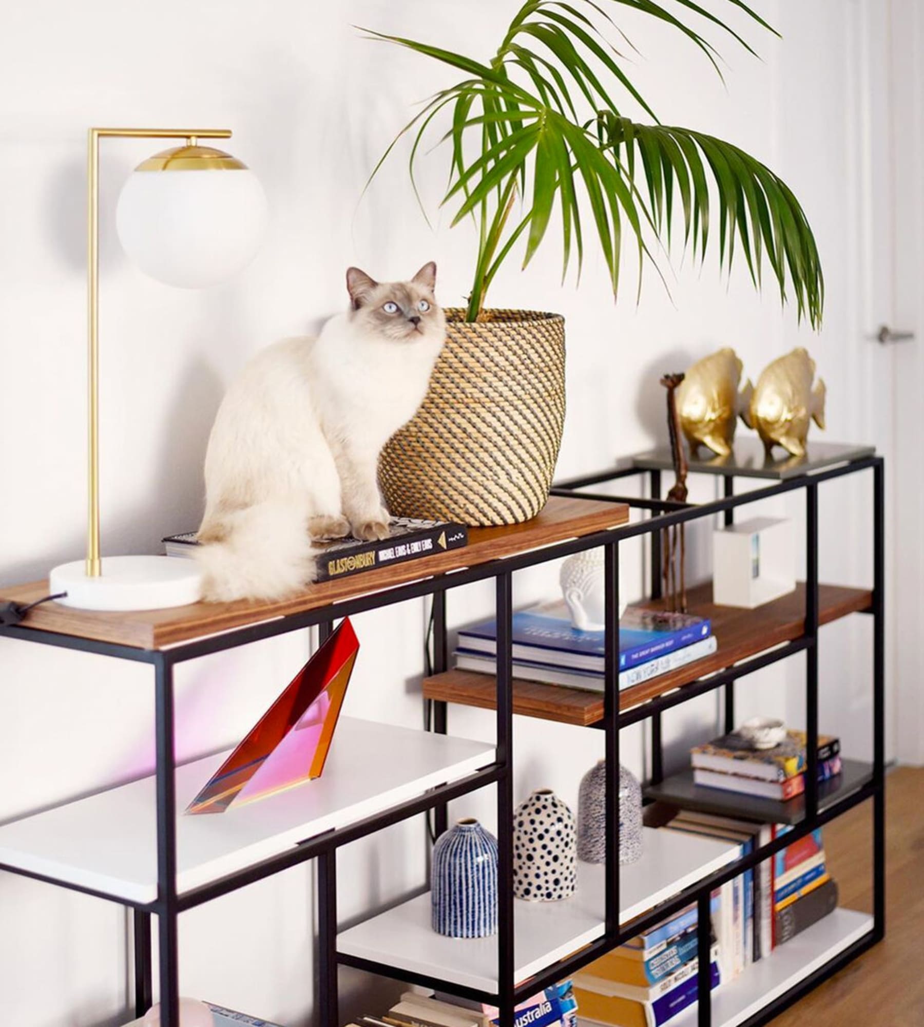
Spread our decorative items to avoid making the shelf look too cluttered and heavy, as seen on the Cliff Shelf.
Don’t underestimate the power of symmetry. You can avoid clutter by spreading out feature-pieces intermittently, using matching pairs or items of similar sizes at uniform intervals along the shelf. This creates a pleasing and eye-catching display, and also draws the eye to the items located in between.
Think function
Incorporate functional or practical pieces to get the best of your open shelf. For example, you could add a decorative catch-all to contain smaller items and keep them within easy reach, without causing clutter. This could be anything from phone chargers to car keys to remote controls. Basically, anything you might need conveniently to hand but don’t necessarily need to see every time you enter the room.
Use different textures and materials

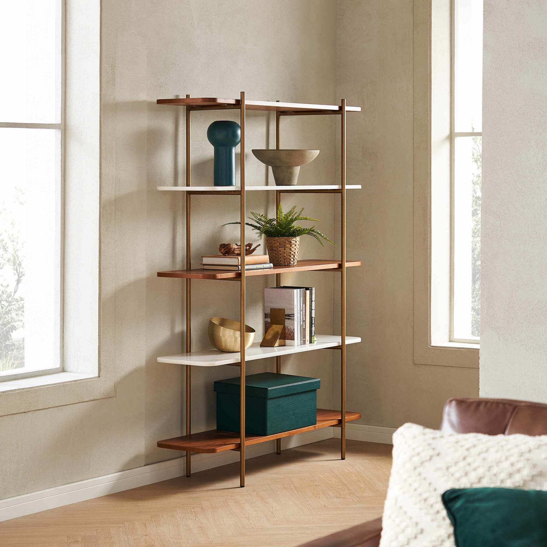
Using decorative objects of different materials can create visual interest and break up the monotony, as seen on the Esther Bookshelf.
Contrasting texture breaks up the monotony, so try and use mixed materials such as glass, wood, metal, or porcelain. Similarly, mix and match colors to create contrast on the shelf, picking out tonal motifs from other items of furniture in the room, such as the sofa cushions, armchair or accent chair. This is a great way to tie the room together and include the shelving unit as a piece of furniture – as part of the design scheme rather than mere storage.
Alignment
It can be very easy to just try and stow away shelving units in the corner or somewhere where they feel out of the way but to really celebrate the shelves then you need to think about positioning in the room. With clever alignment your shelves can make a much bigger impact.

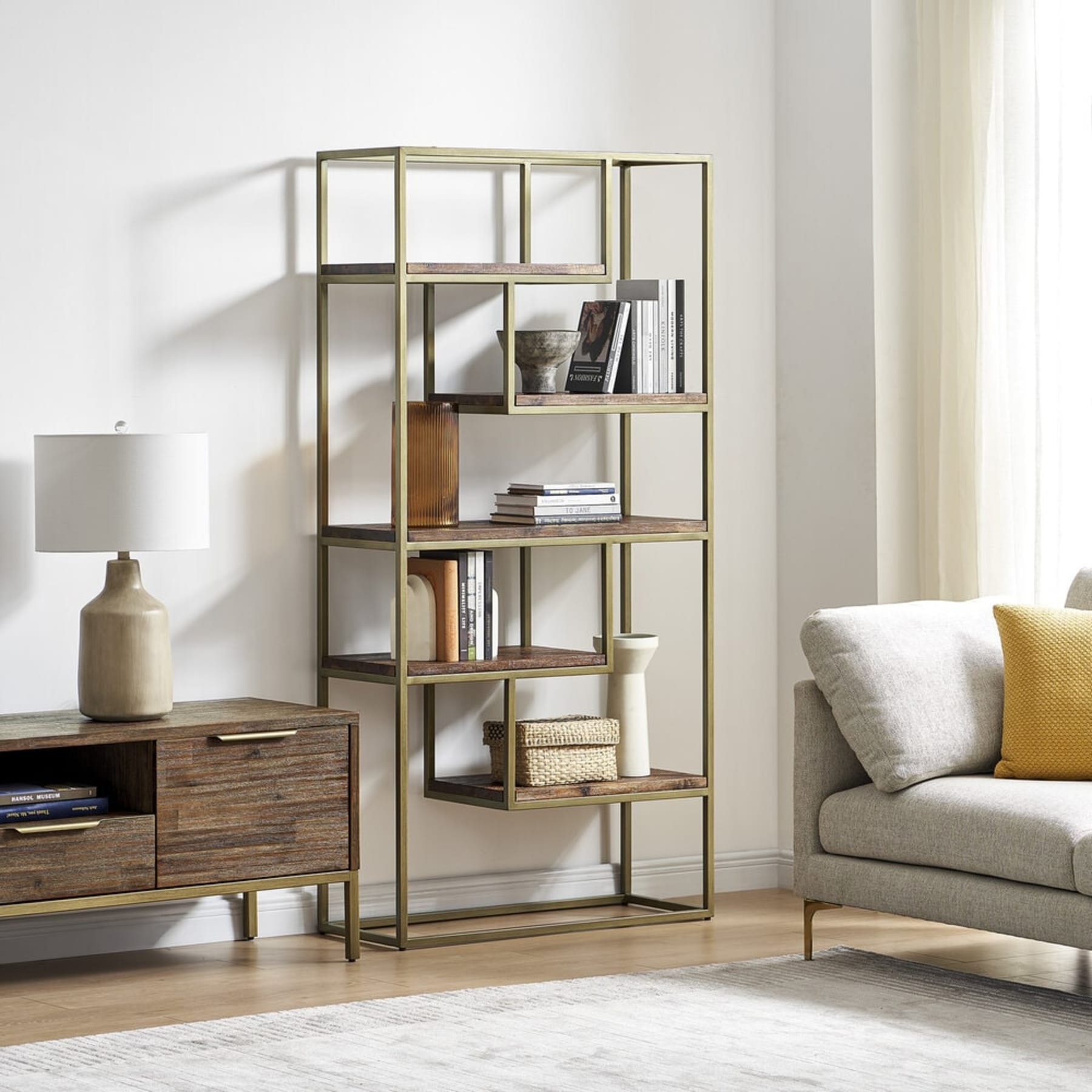
The Hudson Shelf sits adjacent to the Pebble Armchair.
Try and position them aligned with other statement pieces such as the rug, desk or coffee table, really drawing the eye and making the shelves a feature. You can even try combining this with color blocking, using the same color for the shelves as other items of furniture to create the appearance of a color zone or block in the room.
Go green
Shelves can be made from a range of different materials, including wood, metal, and glass. And they don’t have to always be set in right angles, with curved designs, and even circular or modular designs available.
There is an easy way to add a touch of the natural to a shelving unit, and that’s with plants or greenery. A carefully placed burst of greenery, or even color with flowering plants, can soften even the blockiest shelf, with hanging plants particularly able to draw the eye and create a cascading effect.
Work with your style
Perhaps the most important overriding principle is to try and work with your existing style, be that mid-century modern, minimalist, or French farmhouse. Keep your shelves in keeping with what’s around them, allowing the ornaments and placement to stand out rather than the piece itself.
As you can see, shelves and shelving units can be so much more than just dumping grounds for books or utilitarian storage places. A well-positioned and styled shelf can be just as much of a focal point in any room as the coffee table, armchair or even the sofa. And, the best news is, it doesn’t take much effort or money to really make a shelf sing. Some clever placement of ornaments, a healthy-looking hanging plant, or some symmetrical ornaments, and suddenly you’ll start to see your shelves in a completely new light.